Visual identity
WEB / DIGITAL ENVIRONMENTS
These standards define the core visual system for Harris web, mobile and digital product experiences. Use these guidelines to maintain consistent color, typography, controls, alerts, icons and branding across digital interfaces.
Visual identity I WEB / DIGITAL ENVIRONMENTS
COLORS
| Color | Name | Usage |
|---|---|---|
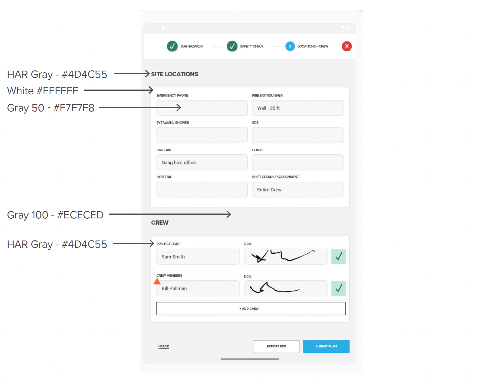
| Gray 500 (HAR Dark Gray) – #4D4C55 | Primary Text, Body Text, Header Fill, Secondary Button Resting Text, Secondary Button Pressed | |
| Blue (HAR Blue) – #29ADE4 | Primary Button, Floating Action Button | |
| UI Blue – #1A8CBB | Pressed/Active Color for Primary Button | |
| White – #FFFFFF | Fill/Text | |
| Gray 50 – #F7F7F8 | Form Fill | |
| Gray 100 – #ECECED | Background | |
| Gray 200 – #DBDCDE | Primary Button Disabled | |
| Gray 300 (HAR Lt. Gray) – #BBBDC0 | Secondary Button Disabled Text/Outline | |
| Green – #2E7D5B | Success Text, Icon Outline | |
| Light Green – #C1E6D6 | Success Fill, Icon fill | |
| Orange (HAR Orange) – #F2612E | Warning Text, Icon Outline | |
| Light Orange – #FDF7F2 | Warning Fill, Icon fill | |
| Red – #E03B3B | Error Text, Icon Outline | |
| Light Red – #FCEDED | Error Fill, Icon fill | |
| Blue (HAR Blue) – #29ADE4 | Info Text, Icon Outline | |
| Light Blue (HAR Blue @ 18%) – #DBF0FB | Info Fill, Icon fill |
Visual identity I WEB / DIGITAL ENVIRONMENTS
COLOR APPLICATIONS
Visual identity I WEB / DIGITAL ENVIRONMENTS
TYPOGRAPHY
Our primary font, Proxima Nova, must be used on all materials. Arial is an acceptable font when Proxima Nova is not available.
Primary font color should be Gray 500 (HAR Dark Gray) – #4D4C55 when on a light background.
When text is on a dark background (e.g. Buttons), default to White – #FFFFFF
| Style | Font | Weight | Size | Line Height |
|---|---|---|---|---|
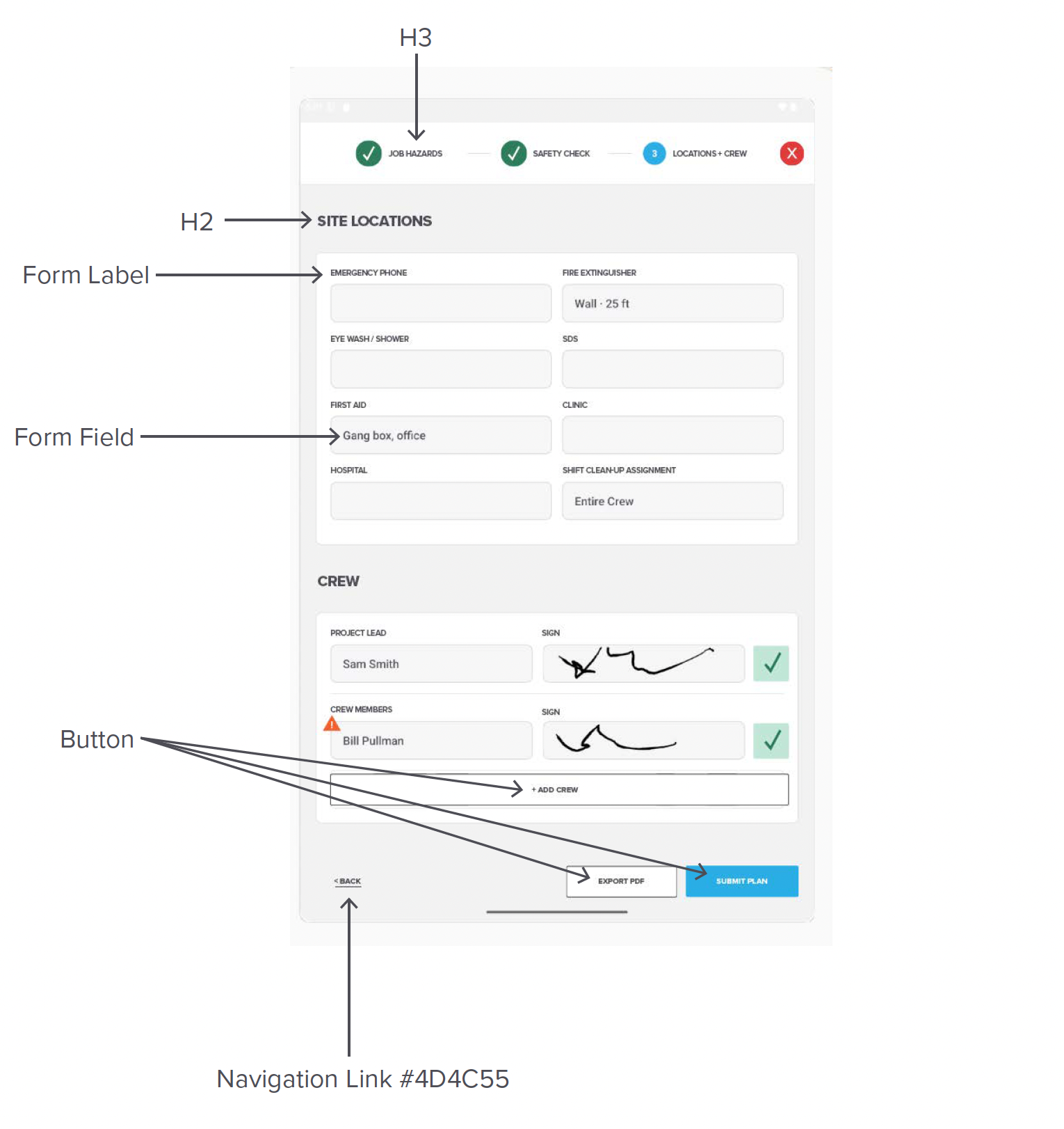
| H1 | Proxima Nova, ALL CAPS | 700 Bold | 32sp/32px | 1.2 |
| H2 | Proxima Nova, ALL CAPS | 500 Medium | 24sp/24px | 1.2 |
| H3 | Proxima Nova, ALL CAPS | 500 Medium | 12sp/12px | 1.2 |
| Regular Text | Proxima Nova | 400 Regular | 16sp/16px | 1.4 |
| Navigation Link | Proxima Nova, ALL CAPS | 500 Medium | 12sp/12px | 1.2 |
| Caption | Proxima Nova | 300 Book | 12sp/12px | 1.2 |
| Button | Proxima Nova, ALL CAPS | 500 Medium | 12sp/12px | 1.2 |
| Form Label | Proxima Nova, ALL CAPS | 500 Medium | 12sp/12px | 1.2 |
| Checklist Item | Proxima Nova | 400 Regular | 12sp/12px | 1.2 |
Visual identity I WEB / DIGITAL ENVIRONMENTS
TYPOGRAPHY APPLICATIONS
Visual identity I WEB / DIGITAL ENVIRONMENTS
BUTTONS, ALERTS + ICONS
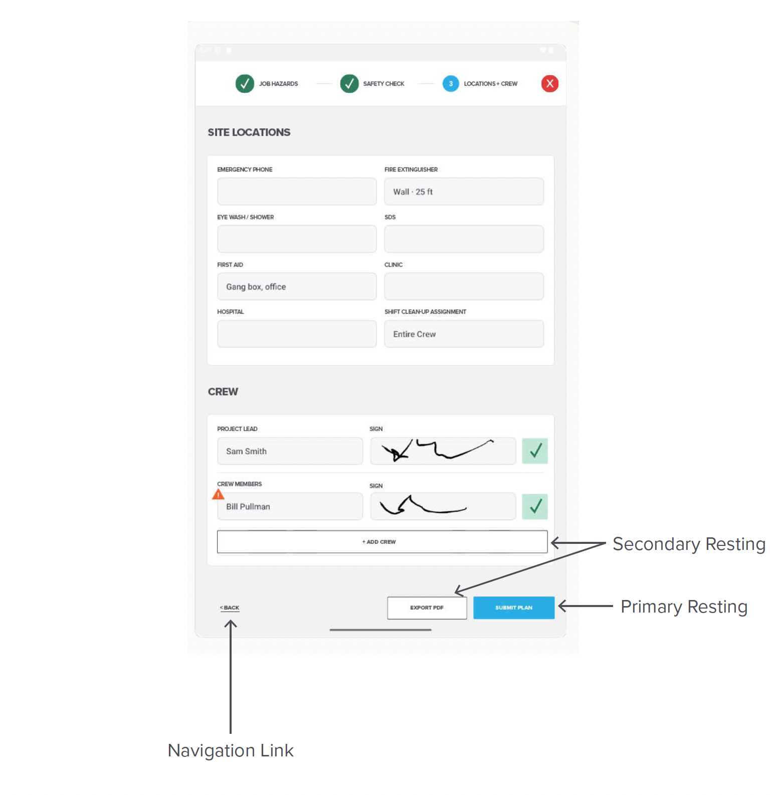
The recommended mobile padding scheme is a 1:2 vertical-to-horizontal ratio. This ensures buttons are easy to press without accidental adjacent taps, while keeping the design spacious and legible.
Corner Radius: 2px
Vertical Padding: 19px
Horizontal Padding: 36px
Text Style: Proxima Nova, ALL CAPS, 700 Bold, 24sp/24px font size, 1.2 line-height
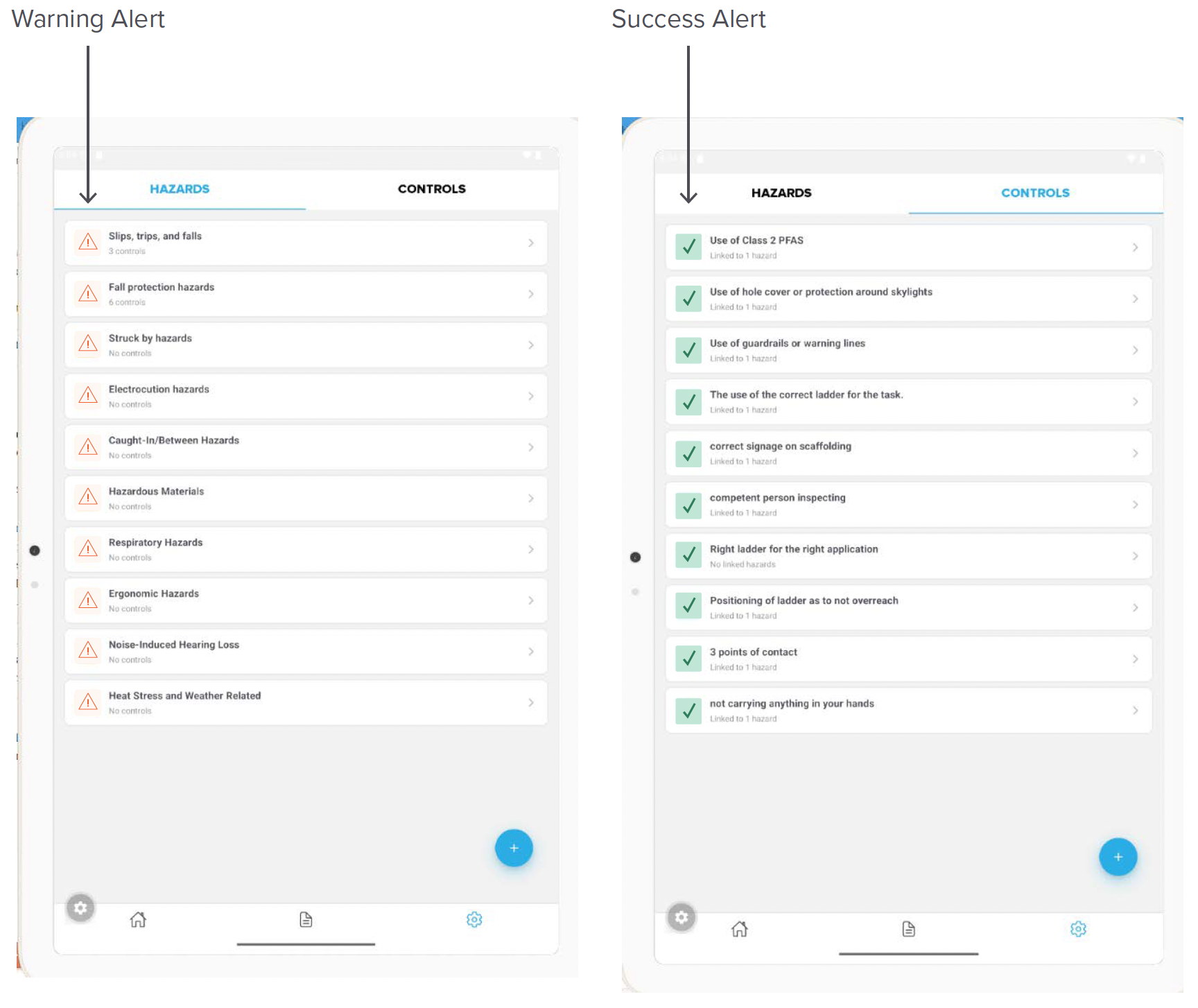
Alerts
Foreground: #2E7D5B
Background: #C1E6D6
Foreground: #157FAC
Background: #DBF0FB
Foreground: #F2612E
Background: #FDF7F2
Foreground: #E03B3B
Background: #FCEDED
Icons

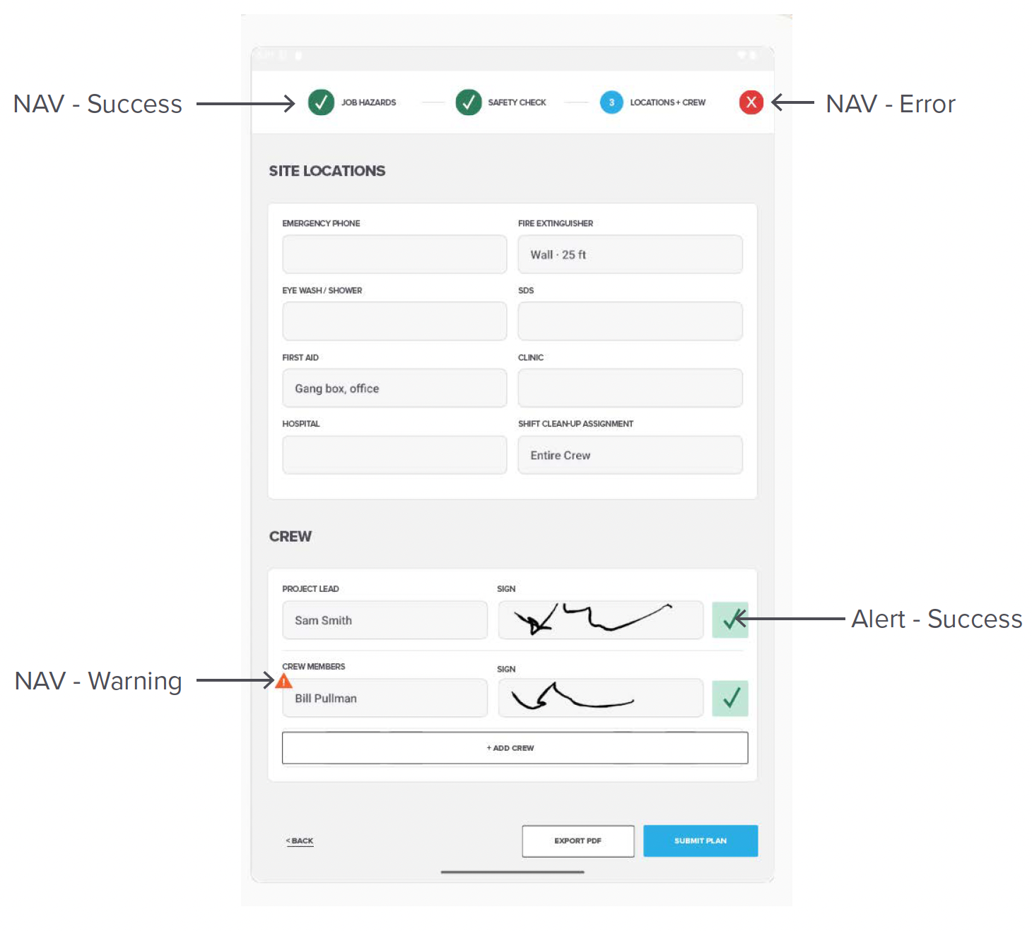
Nav Icons

Visual identity I WEB / DIGITAL ENVIRONMENTS
BUTTON APPLICATIONS
Visual identity I WEB / DIGITAL ENVIRONMENTS
ALERTS APPLICATIONS
Visual identity I WEB / DIGITAL ENVIRONMENTS
NAV ICON APPLICATIONS
Visual identity I WEB / DIGITAL ENVIRONMENTS
LOGOMARK
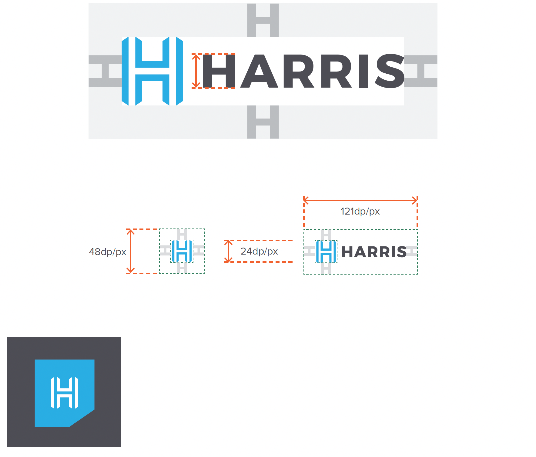
For in-app UI usage (like a header or tab bar) the defined standard size of the Harris logomark is 24×24 dp/px with a 48×48 dp/px tap area.
Placement:
Left-aligned is the most common and recommended option for logos in headers. Center-aligned logos may also work, depending on your overall layout and design.
Visual identity I WEB / DIGITAL ENVIRONMENTS
LOGOMARK APPLICATION
Use the Harris Tearaway Tab logo for mobile headers.