VISUAL IDENTITY I LOGO
GENERAL USE GUIDELINES
Correct
Full color logo on white or light gray background.
CORRECT
White logo on dark photo background.
CORRECT
White logo on color background.
Incorrect
DO NOT use an unapproved color. Tints and shades are not permitted (exceptions allowed for tear away). One color logo can be used in white and black only.
DO NOT skew or rotate the logo.
DO NOT alter the spatial relationship or use alternate type treatments.
DO NOT place the logo over a color or photo with too little contrast.
DO NOT add a drop shadow to the logo.
DO NOT violate required clear space.
VISUAL IDENTITY I LOGO
TEAR AWAY GUIDELINES
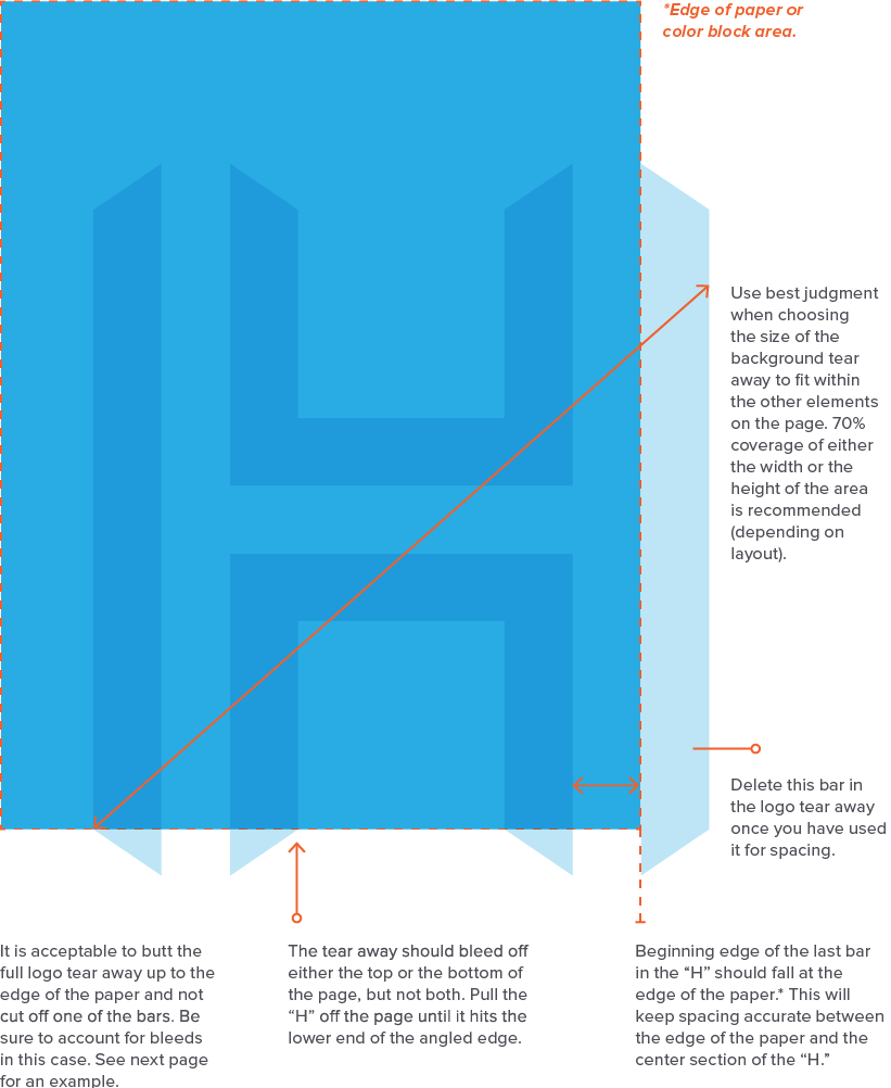
The Harris logo tear away is a great way to reinforce the brand.
The Harris “H” logo mark can be used as a tear away as both a background overlay element and in place of the full Harris logo if the full logo begins the piece, or is shown in close proximity.
Creating the Overlay
Set the color of the “H” to match the background color it is going on top of (i.e. gray for gray). Tear away should be set to the “multiply” blending effect at the following opacity based on usage:
DIGITAL USE
Harris Primary Blue: 30-40%
Harris Primary Gray: 15-25%
PRINT USE
Harris Primary Blue: 40%+
Harris Primary Gray: 25%+
Use best judgment based on printer contrast. This will be different for every printer. It is recommended to use specialty treatments on print pieces to avoid this.
SPECIALTY PRINT USE
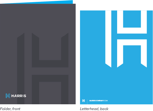
Instead of using the multiply effect, use a specialty print treatment or coating such as spot gloss to make the tear away stand out. (See corporate folder as an example.)
Background Overlay Placement
Correct
DO use the tear away overlay on the primary gray or blue background. It is permissible to use the “H” at 100% white with no blending on statement pieces where no text overlaps. Adding specialty print coatings such as spot gloss can give a luxe feel to key pieces like folders and other company collateral.
DO use the tear away overlay without cutting off one of the bars in the “H.” This is a secondary treatment, but can be useful in brand clarity cases where a customer may be seeing the logo for the first time.

DO overlap the background tear away with text for a bold statement.
Use the logo tear away to add brand equity without repeating the full logo.
Use of the Harris logo tear away without the wordmark is acceptable when the full logo is used in close proximity.
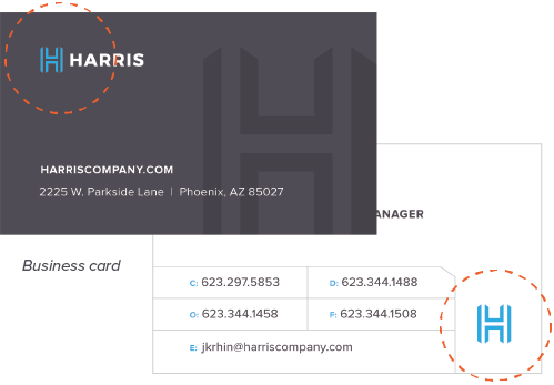
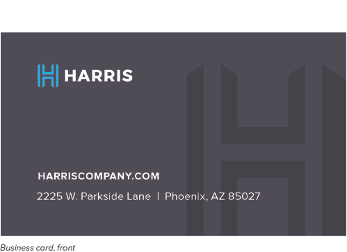
DO use the tear away to represent the Harris brand. See how the tear away is used on the back of the business card to reinforce brand equity without the full logo. This is acceptable because the full logo is shown on the front of the business card.
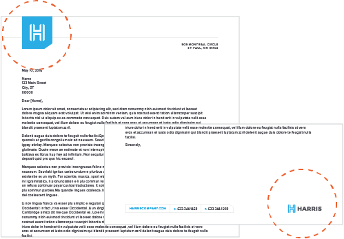
DO use the tear away reversed out to white. See how the tear away is used on top of the letterhead, while the full logo resides at the bottom.
Incorrect

DO NOT use the tear away on top of an unapproved color. Only the Harris primary gray and blue are allowed.

DO NOT make the tear away overlay too small in comparison to the area it fills. It is meant to be a bold element.

DO NOT show the entire tear away overlay top and bottom at the same time. Either the top or bottom should bleed off the edge.

DO NOT bleed off too much of the top/bottom of the tear away. The “H” should bleed off starting at the lowest angle point. (Exceptions allowed for tight horizontal formats.)

DO NOT alter the spatial relationship to the edge of the page/area. The overlay should always butt up to either the left or right side.
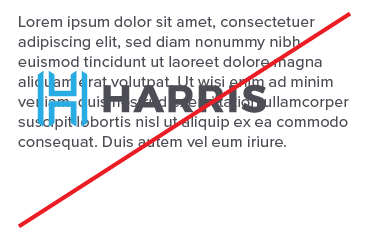
DO NOT overlap too many elements on top of the tear away. Text should enhance the logo in a crisp, bold way.
DO NOT use the tear away in an unapproved color. Only the Harris primary blue and reversed out white are allowed.
DO NOT lock up the Harris name next to the tear away in where it looks like the logo. Instances that need the Harris name present should use the full logo.
DO NOT use the logo tear away on important communication without the full logo present in close proximity.
DO NOT overuse the use of the tear away. No more than one instance on a page is recommended.