Visual identity
Typography
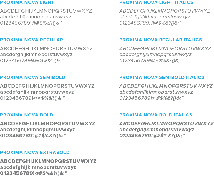
The corporate fonts are a fundamental part of our visual style that help achieve a unique and consistent look across our materials.
Our primary font, Proxima Nova, must be used on all materials (including our website) and communications, if possible.
Websafe font alternative
For collateral that requires the use of a web safe font, (e.g. email) Arial is the preferred typeface. Arial is an acceptable font when Proxima Nova is not available.


Purchase Proxima Nova
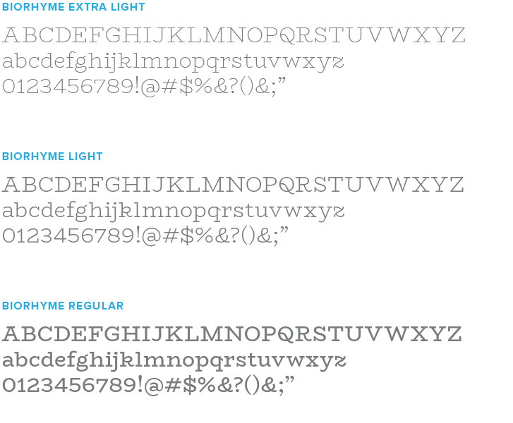
Supplementary fonts are available for specialty use, and help tell the story of our brand by pairing with our primary font, Proxima Nova.
The font BioRhyme should only be used in more casual or playful scenarios in a limited nature, such as a corporate invitation or specialty campaign. Marketing materials that should not use BioRhyme include the company website or corporate signage.
An exception to this rule is the BioRhyme number set. Numbers in this font can be used for callouts or stats in all company collateral, including the website. See subsequent pages for further guidance on usage.


Download BioRhyme
Visual identity I TYPOGRAPHY
Hierarchy
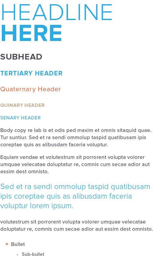
Headlines
A mixture of Proxima Nova Bold and Light is the preferred headline treatment (limit mixture use to once per page or area—use bold only or light only on subsequent headlines within the same area). When applicable, use bold to accentuate key words in the headline. Headlines should be in ALL CAPS with tight leading (e.g. 40pt font with 35pt leading). Kerning should be between 20-30pt. The primary color for main headlines is the Harris blue; however, all versions of the Harris gray and white are also acceptable. It is acceptable to shift font weights for legibility in certain situations (eg. Proxima Nova Regular mixed with Extra Bold may be more legible in a small digital banner ad). In headlines, use the “+” in lieu of the “&” or “and” for a bold treatment (unless it is a long sentence/phrase). Do not use the “+” symbol in body copy (“and” should be used instead).
- Leading = Font Size – 5 (Use judgment with smaller sizes)
- Kerning: 20-30pt
Subheads
Proxima Nova Bold is the preferred subhead treatment. Subheads should be in ALL CAPS with tight leading (e.g. 13pt font with 13pt leading), and should be at least half the size of headlines. Kerning should be between 30-40pt. In cases where multiple layers of hierarchy is needed, title case can be used for subheads and secondary headers (see additional styles on subsequent pages). The primary color for subheads is the Harris gray; however, the Harris blue, white, and shades of gray are also acceptable.
- Leading = Font Size
- Kerning: 30-40pt
Tertiary – Senary headers
Varying weights and sizes of Proxima Nova should be used as tertiary headers and beyond. To maintain hierarchy, each descending header should be equal to or smaller in size than the previous header. Bold, ALL CAPS styling takes hierarchy over sentence case and regular styling (e.g. if descending styles have the same font size, the style above in hierarchy should be bolder and/or all caps). Use differing colors within the Harris palette to add additional hierarchy between headers. Colors can be repeated if other aspects of styling are used to delineate hierarchy. Use visual judgment.
Body Copy
Proxima Nova Regular is the preferred body copy treatment. Leading should be a few points larger than the type size (e.g. 9pt font with 12pt leading). Use visual judgment. Add a small space after paragraph breaks. Do not indent each new paragraph. Harris gray and white are acceptable body copy colors.
- Leading = Font Size + 3
- Kerning: 10pt
Pull quote/callout
Proxima Nova Light is the preferred pull quote treatment. Text size should be a few points larger than body copy size (e.g. 9pt body copy with 14pt pull quote text). Add a small space after paragraph breaks. Do not indent each new paragraph. The primary color for pull quotes is the Harris blue. White and Harris tan are also acceptable on dark backgrounds.
- Text Size = Body Copy Size + 4
- Leading = Font Size + 3
- Kerning: 10pt
Bullets
Bullets should be slightly indented from body copy, and sized equal to or smaller than body copy. Each subsequent bullet in hierarchy should be equal to or smaller than the previous bullet with an additional indent. The primary bullet style is a Harris tan square. The sub-bullet style is a Harris blue right carrot. If these styles are not available, circles are acceptable for primary bullets with dashes for sub-bullets.
- Primary Bullet = Tan Square (Alternate = Tan Circle)
- GID: 479, UNICODE: 25A0, Font: Proxima Nova Regular, Name: BLACK SQUARE
- Sub-bullet = Blue Right Carrot (Alternate = Blue Dash)
- GID: 108, UNICODE: 203A, Font: Proxima Nova Semibold, Name: SINGLE RIGHT-POINTING ANGLE QUOTATION MARK
URL
When listing the company URL, harriscompany.com, do not prefix the web address with “www.”
Visual identity I TYPOGRAPHY
Headline use guidelines
Correct

DO use Proxima Nova Bold to highlight key words or phrases in headlines.
DO use only Proxima Nova Light or Bold in headlines. It is not required to use a mix of both. Do use “+” in lieu of “and” for a bold statement.
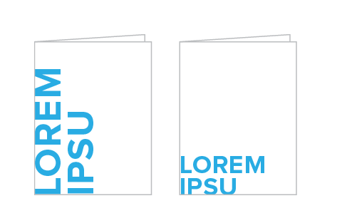
DO use exaggerated headline sizes on statement pieces. Headlines can butt up to edges and/or rotate 90° counterclockwise to add drama.
Incorrect
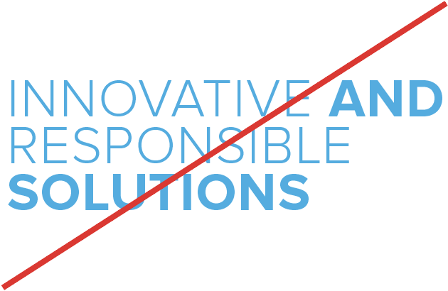
DO NOT bold more than one word that isn’t next to each other in a headline. Bolded words should be adjacent and only used once.
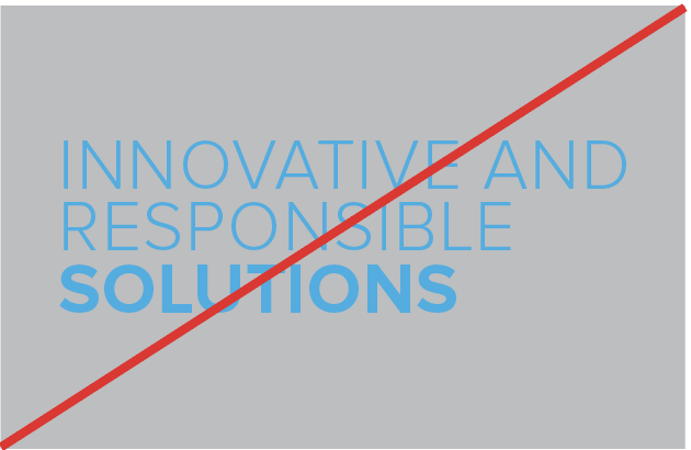
DO NOT use the primary headline color on a background or photo with too little contrast. Instead, try an alternate gray or white.
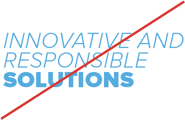
DO NOT use italic fonts in the headline or fonts other than Proxima Nova Bold and Light. (Exceptions allowed for legibility in small sizes).

DO NOT rotate the headline to any degree other than 90° counter clockwise.
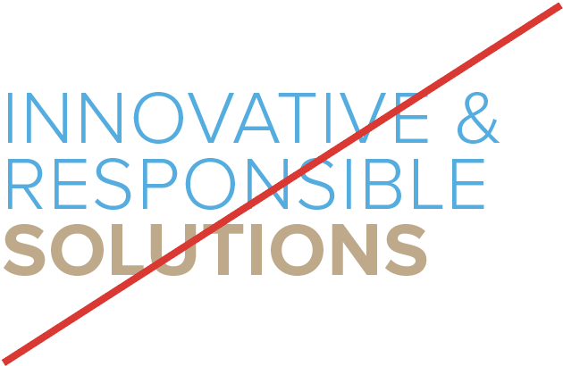
DO NOT mix colors or use unapproved colors within headlines. Do not use “&” (instead use “and” or “+”).

DO NOT leave space between the headline and edge of design if using specialty treatment.
Visual identity I TYPOGRAPHY
Biorhyme guidelines
Correct

Do use BioRhyme as short large statement headlines in ALL CAPS. Do mix BioRhyme with Proxima Nova.
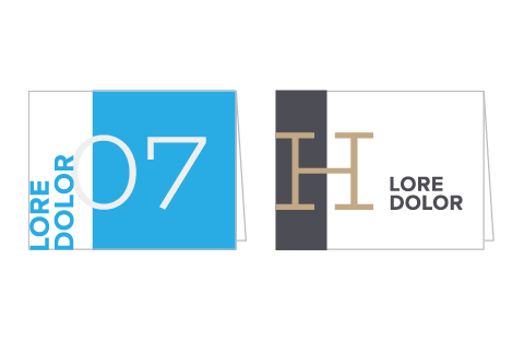
Do use letters or numbers as graphic callouts and design elements.
Do use numbers as statistical callouts or as statement pieces in all brand collateral, including the website.
Incorrect
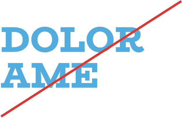
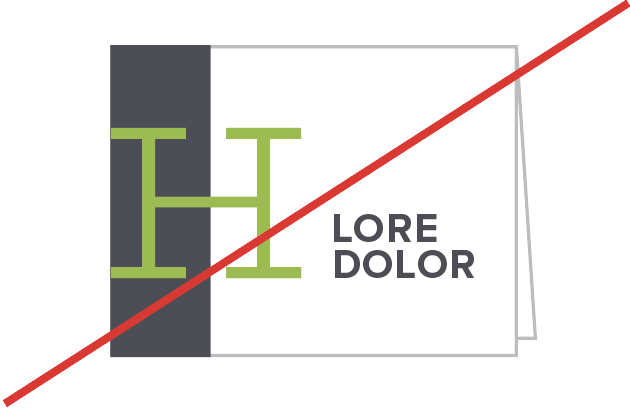
DO NOT use bold or extra bold weights of BioRhyme. The typeface should remain thin, modern and crisp.
DO NOT use BioRhyme on collateral that is not casual, playful or a specialty instance. (Exception for numbers.)

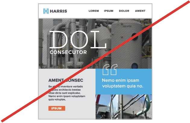
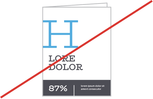
DO NOT use BioRhyme for long headlines. Instead use for 1-3 words for a strong
statement callout.
DO NOT use BioRhyme in unapproved brand colors.
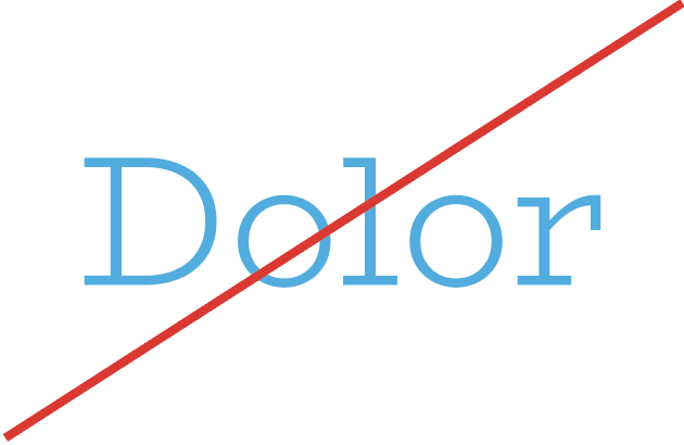
DO NOT use BioRhyme in any format other than ALL CAPS.
DO NOT overuse BioRhyme. Instances should be brief, yet powerful.