Visual identity
Graphic Elements
Special design elements help express the modern, future-focused nature of the Harris brand.
Use these elements together strategically and thoughtfully to enhance the Harris brand and unify our visual identity. The Harris logo tear away is one of these graphic elements. See page 17 for use information.
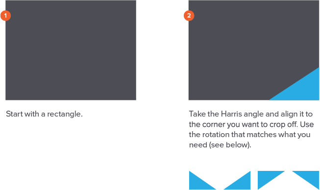
The Harris Angle
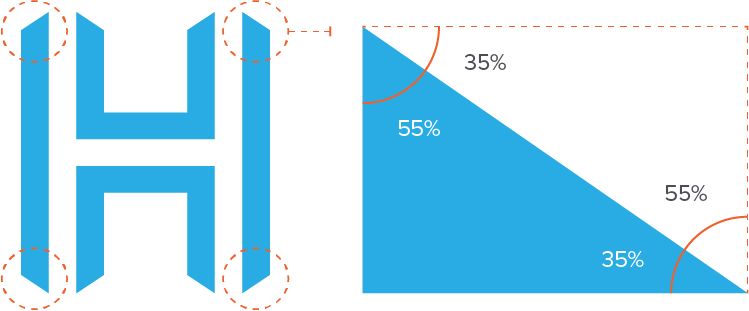
The angles found in the Harris logo tear away are an important part of the Harris visual identity and promote the future-focused mentality of the brand. They are a versatile element that can be used a variety of ways to unite collateral and marketing communications.
The angle is the same for all four corners of tear away and can be used at the four rotations seen in the logo mark. The angle can be used in any of the Harris brand colors.
The four versions of the angle can be used both as a solid right triangle stylistic element and a corner cutout of a rectangle.

Angle Use Guidelines
Correct
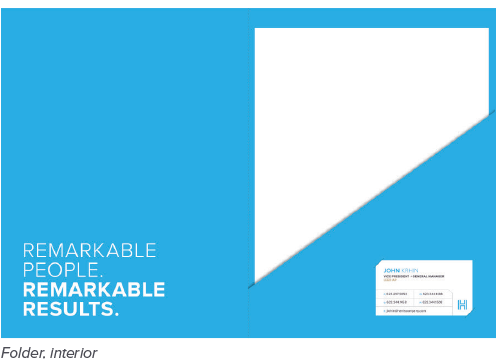
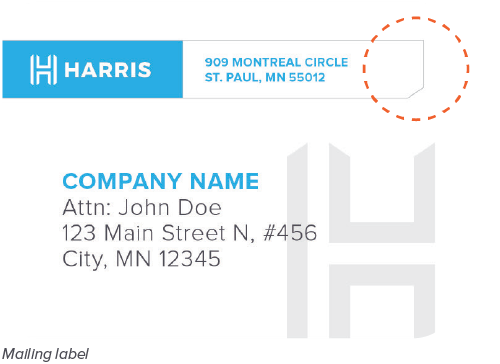
DO use the angle as a die cut in print collateral to further reinforce the Harris brand.
DO use the angle in an outline cut out format. The use of thin lines paired with the angle add a sophisticated edge.

DO use the angle as an overlay on top of imagery. Text can also overlap both the image and angle overlay, if legible.

DO use the angle cut out in both solid color blocks and images to bring in the Harris brand.

DO use up to two angle cut outs in one rectangle.
DO overlap the 90 angle with text for a styled callout.
Incorrect

DO NOT cut out too much of a rectangle so it loses the sophisticated effect.

DO NOT alter the angle. The angle should always match that of the logo on page 27.

DO NOT use more than two angle cut outs in one rectangle.
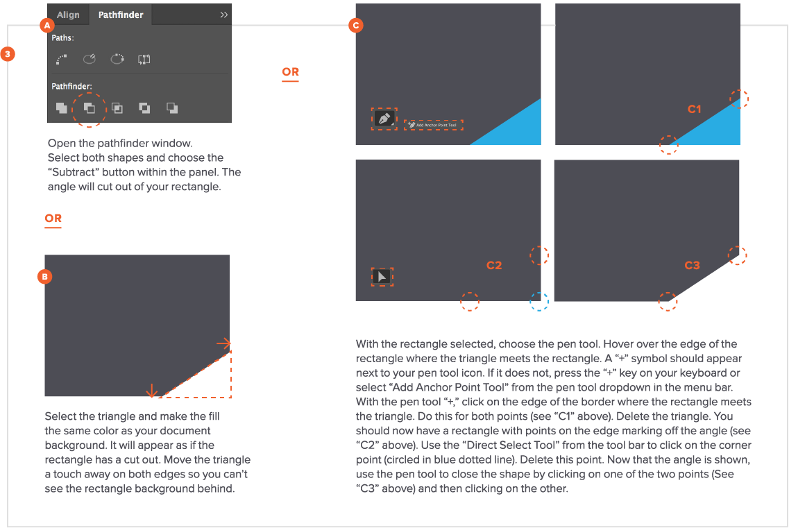
Angle Creation
There are several ways to create the Harris angle cut out in your documents.
InDesign + Illustrator
Microsoft word + Powerpoint
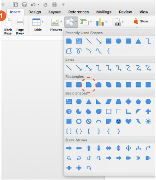
Insert a “Snip Single Corner Rectangle” from the Shapes tab.
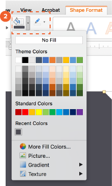
Recolor your shape to the desired fill/outline within the Harris palette.
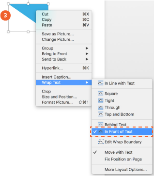
Insert an image of the Harris triangle for reference, and change the text wrapping to “In Front of Text,” so you can position the shapes on top of one another.
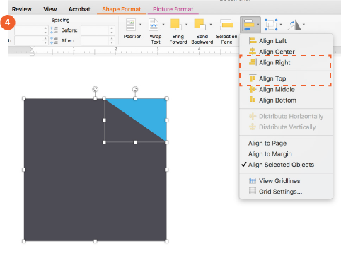
Size the triangle appropriately to your rectangle shape based on how large you want the cut out to be. Select both shapes and use the align functionality to align the shapes by both the top and right sides.
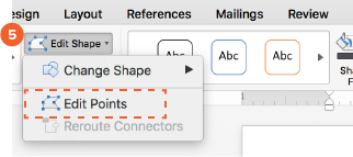
Double click on the rectangle and select “Edit Shape” from the top menu bar. Next, select “Edit Points.”
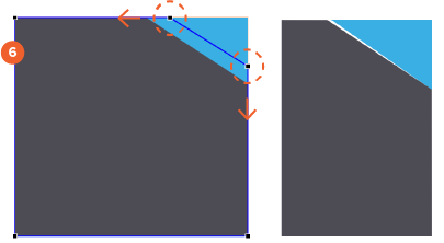
Click and drag the corner points to line up with the Harris triangle. Get as close as possible. You can then use the Edit Points feature to resize the rectangle further, if needed.
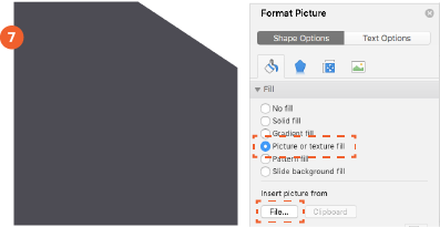
Delete the Harris triangle guide and position/rotate the rectangle as necessary. If you want to insert an image into your shape, select the shape and use the “Format Picture” menu to fill with a Picture.
Tip
Depending how you are using the angle element, it may be easier to copy/paste the desired shape from a different (Adobe) program into the Word/PPT document.
You can also use the triangle overlay technique from the angle creation section.
Powerpoint Image placeholders (slide master)
If you want to create image placeholders in the PowerPoint Slide Master that have the angle element, you must follow a slightly different set of steps.
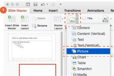
Once in Slide Master, insert an image placeholder.
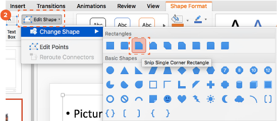
With the image placeholder selected, use the “Edit Shape” button to change the shape of the placeholder to the “Snip Single Corner Rectangle.”
Proceed to follow steps 3-6 from previous section, deleting the triangle reference after you adjust the angle size. When you use the template built from the Slide Master, images added to the placeholder will mask the shape of the triangle cut out.
Tip
You can also use the triangle overlay technique from the angle creation section.
Visual identity I Graphic Elements
Line Use Guidelines
Thin lines add modernity and sophistication to the bold Harris brand.
Use thin line weights (i.e. 0.5-2 pt for letter size paper or 1-2 px for web use). Use your best judgment for larger size applications.
Correct
DO group information using thin gray lines. Incorporate the Harris angle when possible.
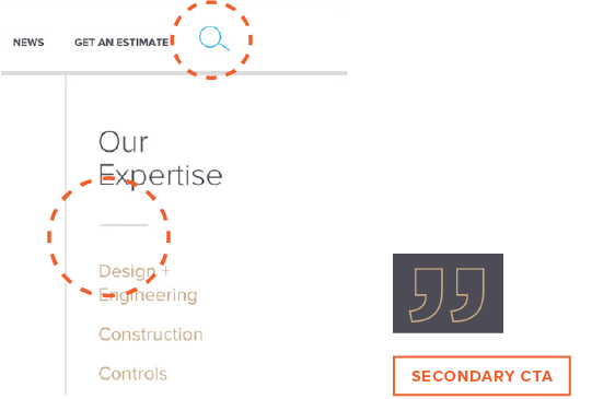
DO use 1-2 px line weights in light gray (20% primary gray) as long and short dividers. All Harris gray shades are acceptable for use. Do use thin line wights when creating icons or buttons. Icons can be created using the full Harris color palette. Secondary CTAs on the Harris site use the Harris orange in an outline format.
Incorrect
DO NOT use a color other than the Harris primary gray or gray shades for divider and chart lines. The Harris blue and tan is acceptable when using below text as an accent.

DO NOT use filled in icons. Icons should be created with thin lines to match the other elements in the Harris brand.
DO NOT use a line weight that is too thick
DO NOT use dark gray line colors on light backgrounds. Lines should be subtle and secondary to the content.
Visual identity I Graphic Elements
Expertise Icons
Our six areas of expertise are represented through custom icons.
Use these icons sparingly to enhance content related to our expertise areas. The Harris brand does not use icons as a main graphic element so they should not be the primary element on the page. These icons should only be used to represent the six expertise areas. Do not use them without reference to their corresponding expertise.
Correct
Design + Engineering
Construction
Service
Controls
Conveyors
Manufacturing
DO use the expertise icons as a subtle design element to enhance the page and reiterate the expertise area.
Incorrect
DO NOT alter the line weight. The line weight should remain thin relative to the page size.
DO NOT use the expertise icons in more than one color. All Harris colors are acceptable for use, but should appear subtle on the page.
DO NOT use the expertise icon as the main graphic element.
Visual identity I Graphic Elements
Charts + Graphs
Data is a powerful way to tell the Harris story. Strive to use factual evidence in external communications.
Use tints of the Harris blue and primary gray to tell this data story. There will be instances where using tints is not applicable. Use best judgment for clarity.
CORRECT
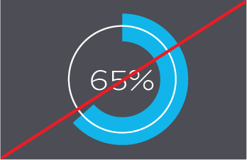
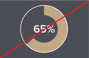
DO use pie charts in the Harris blue or tan when calling out one percentage data point. Pie charts should always reside on the primary gray background with a white 1-2px/pt center stroke and white, centered text in Proxima Nova Medium, Semibold or Bold.
Incorrect
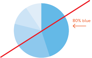
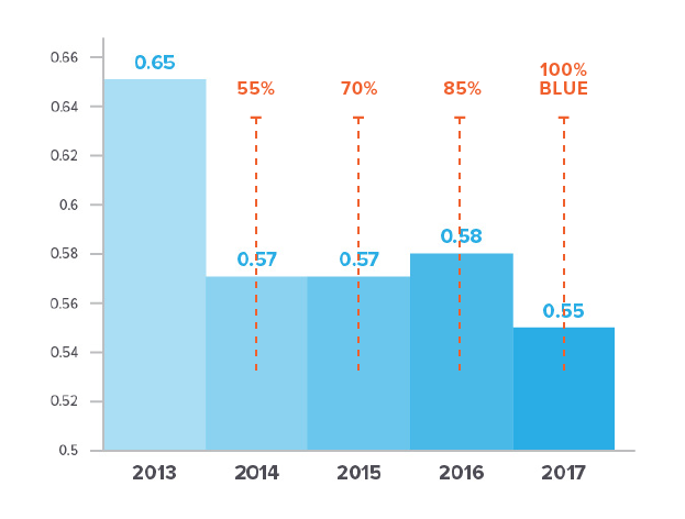
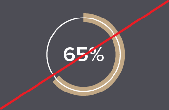
DO NOT create a tinted graph/chart that does not start or end with 100% Harris blue. This would be correct if the 80% blue was at 100%.

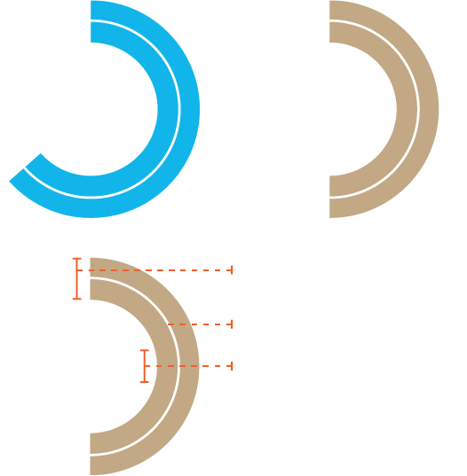
DO NOT use tints of the Harris blue or primary gray out of descending or ascending order.

DO NOT use colors other than the Harris blue or primary gray in tinted charts/graphs. All Harris colors are acceptable for regular charts/graphs.

DO NOT add spaces between the sections (unless it is necessary for clarity/data grouping).

DO NOT mix colors when using a tinted color scheme (unless it is imperative for clarity).
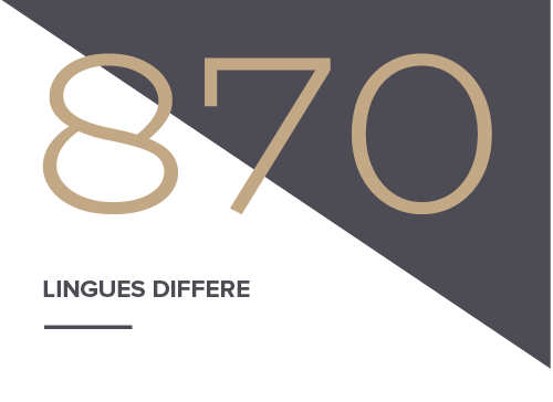
One-off data points are a powerful stand-alone element.
As expressed on the previously, using tints of the Harris blue will not work to showcase data in all instances. In cases where one percentage is used, a pie chart style is available. For one-off data points that are not a percentage, use BioRhyme to write it out in text format.
CORRECT
DO use pie charts in the Harris blue or tan when calling out one percentage data point. Pie charts should always reside on the primary gray background with a white 1-2px/pt center stroke and white, centered text in Proxima Nova Medium, Semibold or Bold.
Incorrect
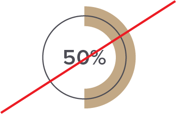
DO NOT use any color but white on the center circle and percentage text. Pie chart should always reside on the primary gray background.
DO NOT use unapproved fonts or font weights in the center. Proxima Nova Medium, Semibold or Bold are the only acceptable fonts.
DO NOT alter the placement of the interior white circle or percentage stroke. The two strokes should always be centered on one another.
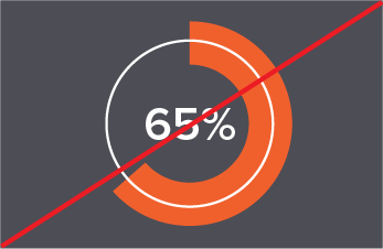
DO NOT use unapproved colors for the chart. Harris blue and tan are the only acceptable colors for the percentage stroke.
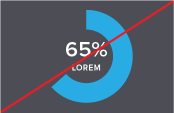
DO NOT add additional copy within the circle. Supporting text can be added under or to the right of the pie chart. Only the percentage should show within the chart.
DO NOT alter the stroke size in any way other than the approved sizing.